

OBJECTIVE
Develop a complete brand identity system that reflects Furry Friends’ energy, builds trust, and supports their launch and long-term growth.
SCOPE: Logo Design, Brand Design, Graphic Design
OUTCOME
By combining thoughtful strategy with detailed design execution, the brand now communicates energy, trust, and fun in a way that resonates with their audience and supports their growth.
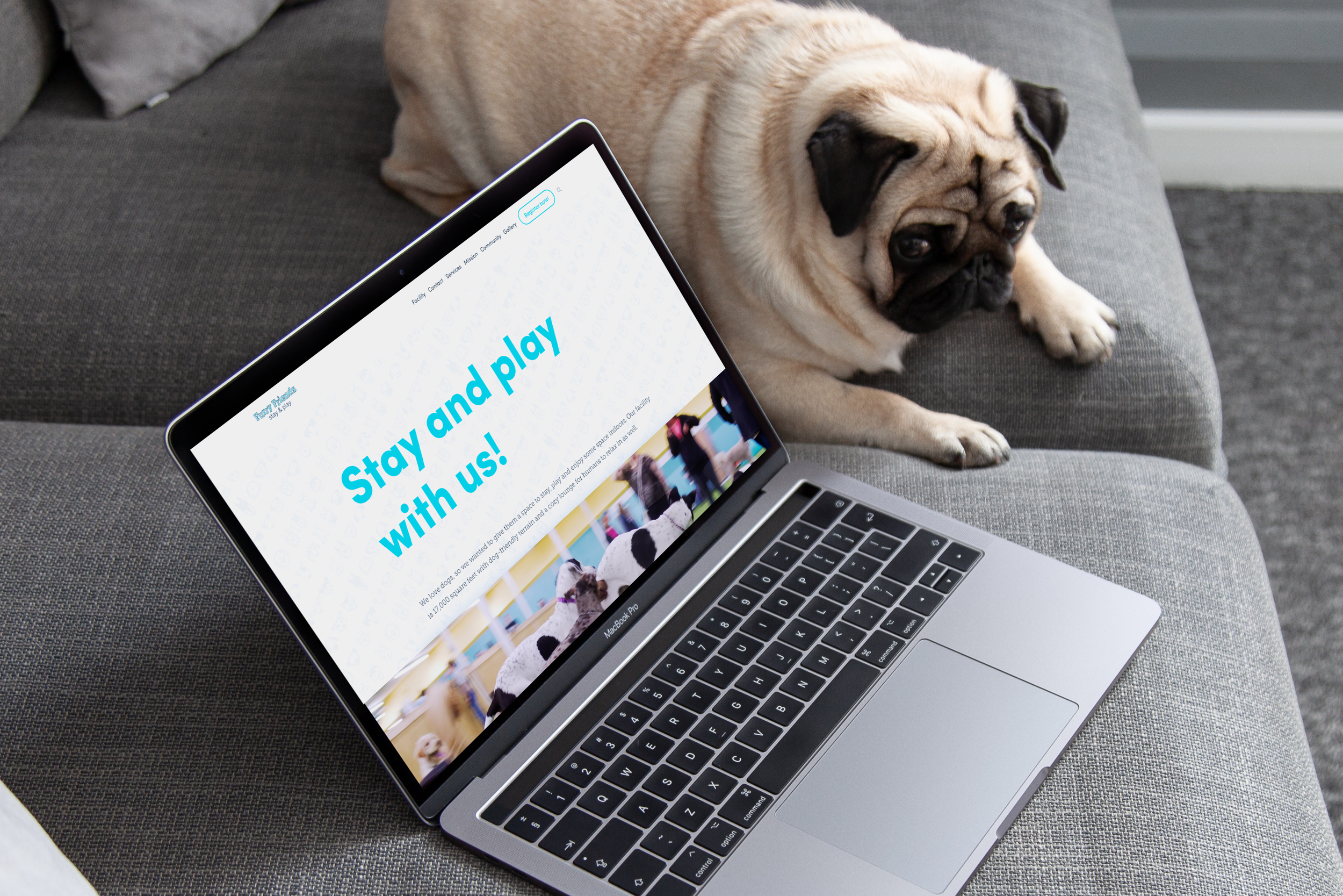
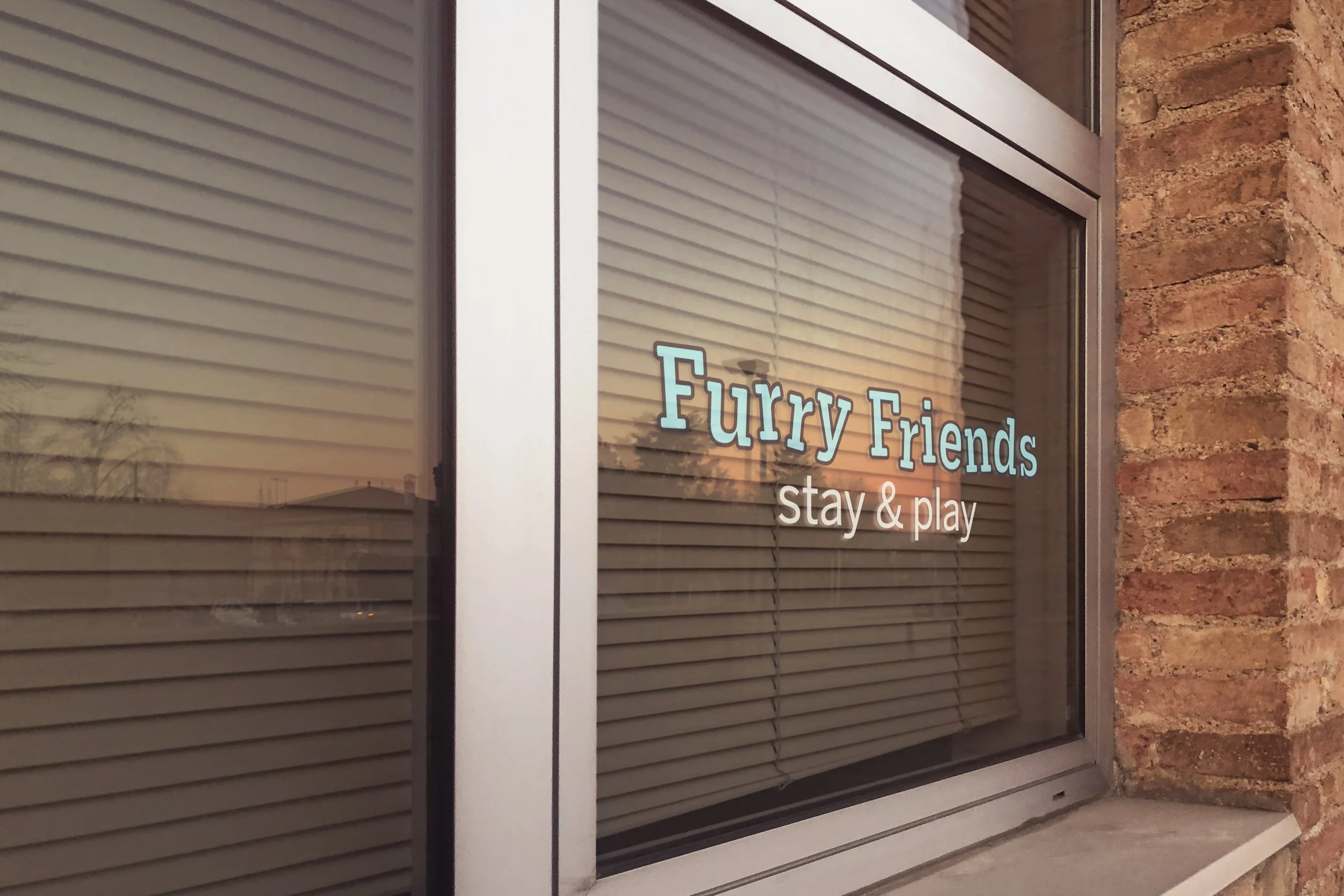
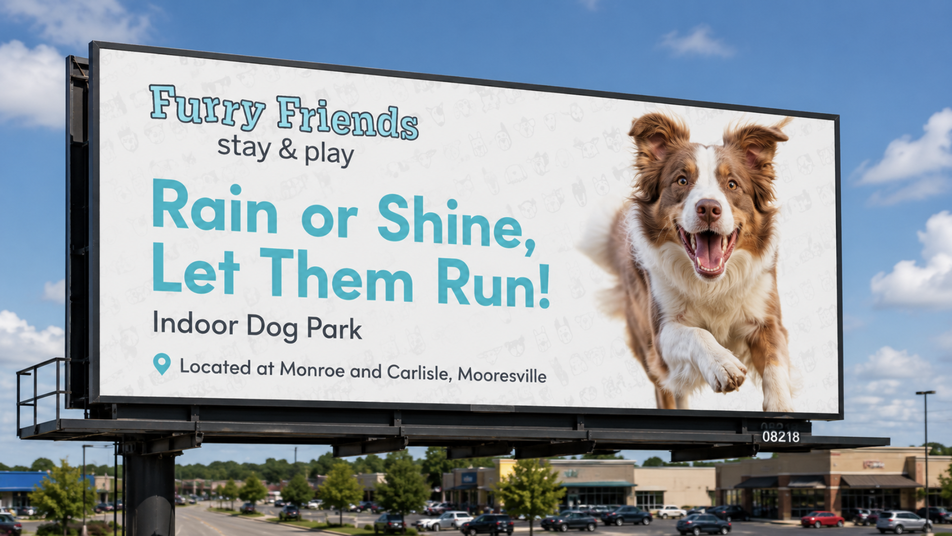
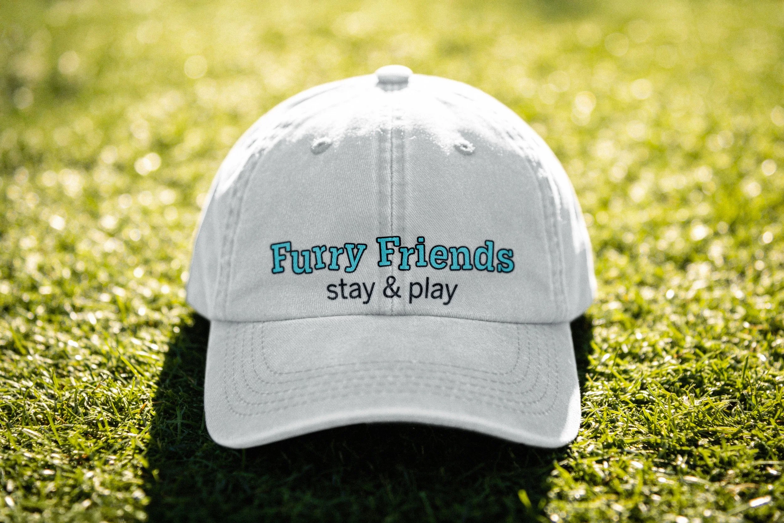
Furry Friends Stay & Play now has a fully developed brand identity that reflects the personality and experience of their indoor dog park. The system provides a strong, recognizable foundation that can be applied across signage, merchandise, social media, and in-facility design.


Overview
We worked with Furry Friends from the ground up, transforming an early-stage concept and placeholder logo into a fully realized brand system. Through a structured discovery process and iterative design approach, we created a brand that feels energetic, trustworthy, and approachable. The final identity includes a custom wordmark, cohesive color palette, and a full suite of supporting visual elements. By building a flexible and scalable system, we equipped Furry Friends with the tools they need to maintain consistency across their space, marketing, and digital presence. The result is a brand that not only stands out but also aligns with the experience they aim to create for their customers.
Process & Workflow
Discovery & Direction
Led a discovery session with the owner to define:
Brand values: trustworthy, energetic, uplifting
Business goals and long-term vision
Target audience and customer experience
Established a clear creative direction to guide the identity development process.
Mood Board & Visual Direction
Created a mood board to visually represent the brand’s tone and personality.
Developed a color palette that supports:
Energy and playfulness
Approachability and trust
Used this phase to align on the overall look and feel before diving into logo design.
Logo Exploration & Development
Began with extensive hand-drawn sketching, exploring a wide range of concepts.
Narrowed down concepts based on alignment with brand values and usability.
Transitioned selected concepts into a digital format for further refinement.
Developed multiple iterations of top logo directions, focusing on balance, readability, and personality.
Presented four refined black-and-white concepts for review and feedback.
Finalized a custom wordmark based on collaborative feedback and design refinement.
Brand System Development
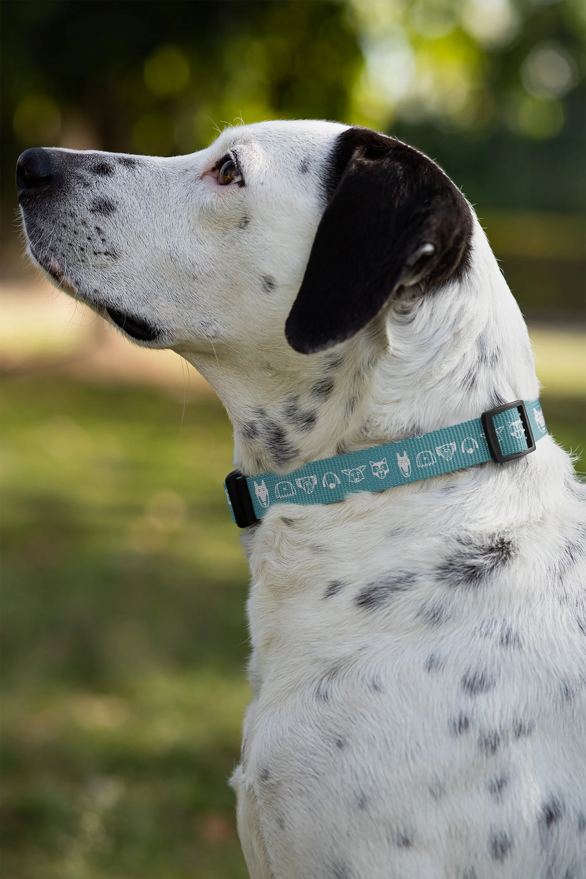
Built a complete visual system around the final logo, including:
Hand-rendered icon set
Custom repeating pattern
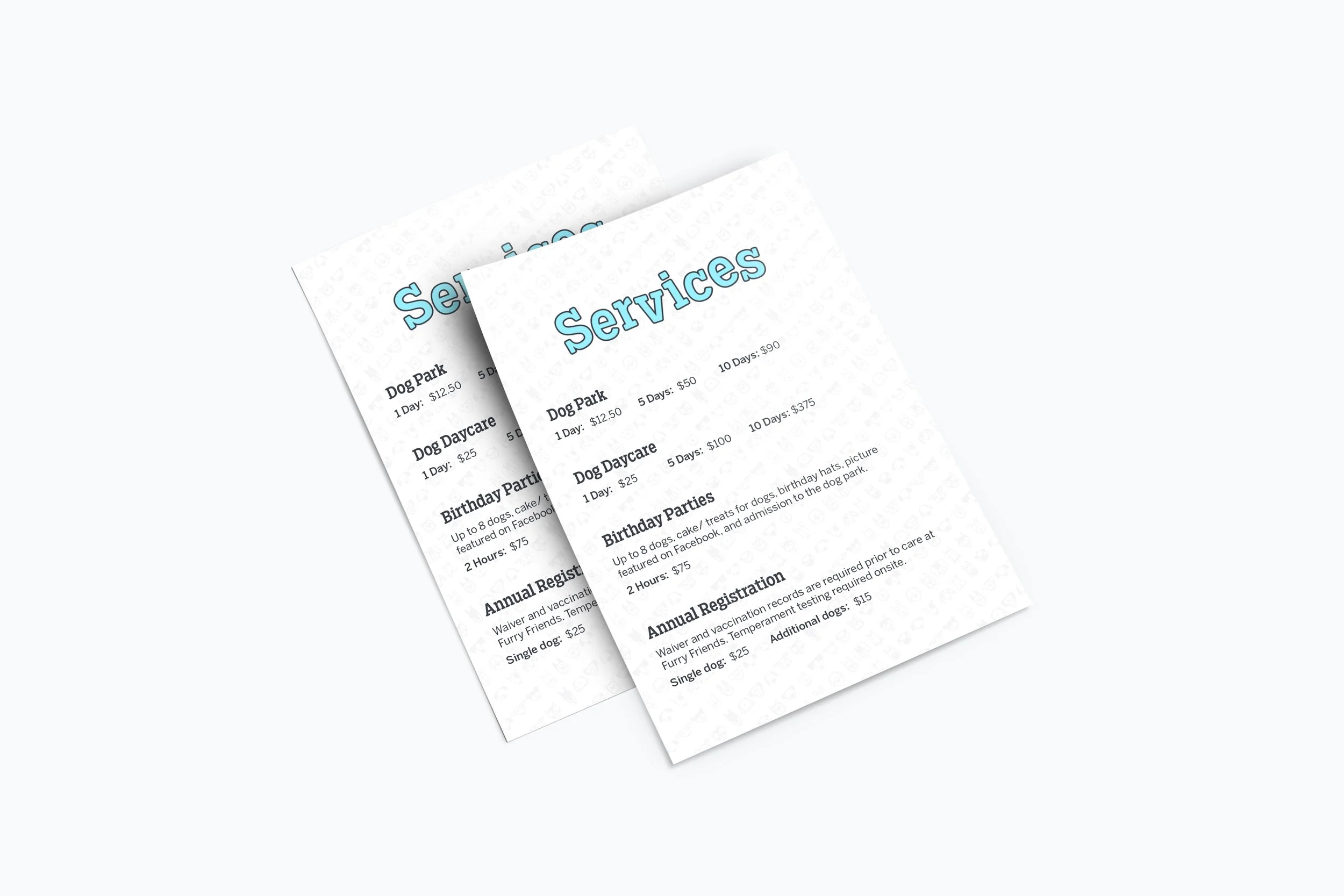
Custom typography treatment
Ensured all elements worked together cohesively across both physical and digital applications.